Chapter 15. Data Presentation
The way data are presented can have a big influence on your interpretation.
Lots of ways to show something
There are usually countless ways of presenting the same data. You are already familiar with the difference between raw numbers, tables, and graphs. Microsoft Excel gives you many choices of graph (chart) types, and if you have ever attempted to make a graph in Excel, you can probably appreciate the immense variety of ways there are to show something (what kind of chart, what colors to use, how wide to make lines and bars, where to put the text, ...), and how easy it is to make it more complicated than you want.
Data presentation is not just about making something pretty. Choice of one presentation format over another can influence how people respond to or evaluate the data. You will encounter examples of this many times in your lives (and no doubt already have), as the method of data presentation is often a deliberate attempt to influence you. Furthermore, how you interpret the data could make a difference to you. People who were around in the 1960s may remember a Peace Corps commercial with a glass that was half full of milk. The ad pointed out that you could interpret the glass as ‘half full’ or ‘half empty.’ A current but disturbing example of this same issue is seen in the CDC (Center for Disease Control) web page on condom efficacy against sexually transmitted disease. In the past, the web page emphasized that proper condom use had been shown to greatly reduce the transmission of HIV. Now, perhaps under pressure from an Executive Administration that wants to discourage promiscuity, the web page emphasizes that HIV transmission can occur even when condoms are properly used. Both views are correct – condoms have been shown to drastically cut HIV transmission, but some transmissions have occurred among ‘consistent’ condom users.
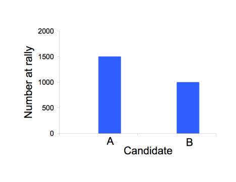
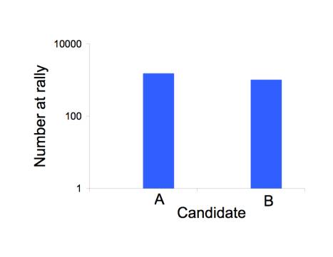
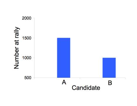
The scale of numbers used to illustrate a point can have a big effect on perception, as in the figure below. All three figures show the same invented data about the number of attendants at a rally for candidate A (1500) and for candidate B (1000). The most legitimate representation is in the top figure. The bottom figure appears to inflate the excess for candidate 2 by starting the vertical axis at 500 instead of 0. The middle figure appears to deflate the excess by using a log scale.
How to market a new drug or medical procedure: relative versus absolute benefits
The marketing of new drugs and medical procedures (mammography , certain cancer treatments) has reached unprecedented levels. It is not uncommon to hear that a cholesterol-lowering drug (known as a statin) reduced mortality by 20%, or that some other medical offering improves outcomes by an appreciable percentage.
A percentage is a relative measure. The alternative is an absolute measure.
To fully appreciate the difference, let’s invent some numbers and present them both ways. Suppose we tell you that a new drug – which may have some side effects – reduces death from heart attacks by 50% for people in your parents’ age group over 5 years. How strongly would you encourage your parents to go on this drug? Many of you would no doubt be enthusiastic. It sounds too good to be true.
Now let’s present the same data as absolute rates. For 1000 people in your parents’ age group that do not take the drug, there are 4 heart attack deaths every 5 years; if they are on the drug, the number of heart attack deaths would be 2. Thus, the drug will save one heart attack death in 5 years for every 500 people taking it. Is your level of enthusiasm still the same? How about if we told you that the number of total deaths was not statistically different between those taking the drug and those not taking it?
Most medical data are now given to the public in relative numbers. It may be no coincidence that those data presentations often ultimately come from those who benefit from having you buy the drug. The number ‘50%’ is intrinsically impressive, because it makes us automatically think of ‘half.’ But in many cases the 50% applies to only a very small fraction of the total. It’s not the same as telling you that 50% of you will improve your grades if you buy my course packet. It’s more like telling you that, for those of you in the lowest 2% of the class, 50% of you will improve your grades by purchasing my packet.
Diagnostic tests: don’t be alarmed (or overconfident) at initial test results
There is now an impressive and bewildering array of tests that can be run on us: many types of cancer screening, STD tests, blood cell counts, and drug tests; there are also lots of enzymes that can be measured as some indicator of metabolic health. How common are mistakes? Or more importantly, if you get an unexpected result (e.g., a positive HIV test), what is the chance that it is wrong? A test result that is erroneously positive is known as a false positive.
The way that numbers are typically presented by medical practitioners is so confusing that almost no one seems to know how to answer this question, even the practitioners themselves (a book ‘Calculated Risks’ by G. Gigerenzer makes this point in detail). For instance, consider the following numbers for a fictitious viral infection
|
1% |
fraction of population infected |
|
99% |
fraction of population not infected |
|
90% |
how often an infected person tests positive |
|
2% |
how often an uninfected person tests positive |
Can you convert these numbers into the probability that a positive test is in error? Not many people can. It goes like this:
Prob. of false positive = (all positive tests from uninfected people)/ (all positive tests)
= (0.99 x .02) / (0.99 x .02 + 0.01 x 0.9)
= .06875 ≈ 2/3
Simple, eh?
It is possible to present the data in a more intuitive way. The probabilities presented above can be given as numbers of people in different categories. For example, if we imagine testing 100 people, then
|
1 is infected and has a 90% chance of testing positive |
|
the other 99 are not infected, but nearly 2 of them will test positive |
It is now fairly simple to see that, out of 100 people, there will be nearly 3 positive tests, and 2 of them will be from uninfected people.
Studies have been done in which the two methods of data presentation were given to different subjects. The ones who were taught the second method had a far better chance of making the correct calculation than were the subjects taught the first method.
Why might this matter? Medical personnel are the ones handing out test results. Most of them are apparently unaware of how to calculate these probabilities. They have unknowingly told people with positive HIV tests that their test results indicate infection with virtual certainty. People have been known to kill themselves or engage in risky behavior upon receiving positive results, and in some cases at least, the results were erroneous. Had they realized how likely it is that the results were wrong, a great deal of their angst could have been avoided.
The point here is that there is a simple way to present the data that can be grasped by many people. In contrast to the use of relative versus absolute numbers, here the misunderstanding created by presenting numbers the ‘hard’ way seems to benefit no one.
The scale used to provide choices
An interesting phenomenon is observed in the way choices are provided to people who are uncertain about the answer. If asked for their best guess as to the probability of some rare event about which they are not sure, people tend to choose from the middle of the options. Thus the questionnaire itself can influence the response.
Suppose you are asked for your guess as to the probability of contracting HIV in a single, unprotected sexual encounter with someone who is infected. On one form the choices presented are
|
< 0.01% |
0.01% |
0.1% |
1% |
10% |
> 10% |
and on another form the options are
|
< 1% |
1% |
10% |
20% |
40% |
> 40% |
people will tend to choose higher probabilities in the second set. This makes no sense of course, if a person actually knows what the probability is. When they don’t, they apparently tend to use the range given as a guide. Someone can, of course, use this knowledge to influence the outcome of a survey. One way to overcome this problem is to ask the respondents to provide their own estimate, without giving them multiple choices.
Summaries versus the Raw Data
As consumers of information, we are exposed to many levels of simplification. If we desperately wanted to know what a study found, we should obtain the raw data and analyze it ourselves. This option is rarely pursued, except by researchers with a strong interest in the study. The next level of getting close to the actual data is to read the original publication. Yet even the published study omits many details: it will provide statistical summaries of the data, and some data may be omitted entirely. Much of the driving force behind this initial compaction of data comes from the journals themselves. Prestigious journals have limited space, and a paper that presents the raw data is usually too long to get published. The authors of a study are almost always told to shorten their document.
Beyond this first round of simplification (in the original paper itself), important studies are often written up in other sources – newspapers, magazines, and the web. In some cases, especially with medicine, professional societies and journals may commission a formal summary and overview of the study. This next level affords a striking opportunity to compress information and even to distort it, such as overselling the study and claiming that its results apply more broadly than is indicated by the data. This form of exaggeration has been documented in summaries of clinical trials: the actual study finds a modest benefit of a drug in a narrow set of patients (e.g., men aged 50-60), and the summary claimed a benefit to a much wider audience (e.g., men aged 40+ or men AND women).
We all have limited time. Thus it is not surprising that summaries of studies are read far more widely than is the study itself. It is thus important to know whether a summary accurately reflects the original study, but this knowledge is often difficult to obtain without effort. Two books have documented several such abuses in medicine, and the overselling of drug benefits may stem from financial ties between the authors of the summaries and the companies whose drug was tested. (See ‘Overdosed America’ by J. Abramson and ‘Should I be Tested for Cancer’ by H. G. Welch.)
Copyright 2007 Craig M. Pease & James J. Bull