Students commonly use Microsoft PowerPoint to design posters. If you want a more sophisticated program, you can try Adobe InDesign, Illustrator, or Photoshop.
Page Setup
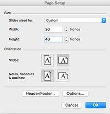 |
Before you begin poster layout, make sure that the page size is the same as your final print size. To change the page size in Microsoft PowerPoint, go to “File” and select “Page Setup.” The event where you are presenting may specify poster dimensions, but generally, dimensions are 46” – 50” x 40” |
Graphics

Using visual aids such as images, charts, figures, timelines, and diagrams is a great way to make your poster less text-heavy and more visually appealing. Make sure your graphics are simple, consistent in scale, properly labeled, and legible from at least three feet away.
When possible, use data to create figures instead of simply listing the data in a table.
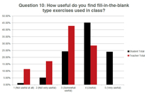
Effective graphs have labeled axes with units of measurement, a legend, a title, and use consistent colors.
Photos
Do not simply copy and paste photos from the web, for two reasons. First, photos printed as part of a poster should be at least 300ppi, but website photos are typically 72ppi and will turn out fuzzy when they are printed. Second, it is not appropriate to use someone else’s photos unless they have published them under a license that allows you to do so. Many photos released under Creative Commons licenses can be used for academic purposes with minimal restrictions.
Text Format
Do not use more than two different fonts on your poster. The minimum text size for a poster is 16 pt. Headings should be between 30 and 60 pt, and the poster title should be over 72 pt. Because the physical dimensions of posters can vary it can be hard to pin down an exact size to make your body text, but the general rule is that each column of text should have 11-12 words per line.
Choose fonts that are attractive and easy to read. Some good ones include Helvetica, Times New Roman, Trebuchet, and Century Gothic. Sans serif fonts (e.g. Helvetica) usually work a little better than serif fonts (e.g. Cambria). Avoid fonts that are clichéd, too distinctive, or unprofessional (e.g. Comic Sans, Papyrus).
Use bold or italicized type sparingly to emphasize certain text. Do not underline or use capital letters for emphasis.
Colors
Use a light color for backgrounds and a dark color for text. Avoid distracting viewers with patterns or complex images in the background. When using multiple colors to add emphasis, be consistent and keep the color palette limited. Viewers tend to look for a pattern in a series of colors rather than absorb the information. Avoid bright or clashing colors that will exhaust the viewers’ eyes.
When using color to create contrast, remember that some people cannot distinguish between certain colors, such as red and green.
 |
Notice in this poster that there is red text on a green background, which is difficult to read for those who are color-blind. |
 |
It is difficult to read black text on a dark background. |
White Space
Divide the sections of your poster logically by using empty, white space. If there is too much information to fit in white space, either take out some information or summarize the information more concisely.
 |
This poster does not have enough white space. |